Project 1 - Presentation
Close to Home: Motherhood- Final Production
Artist Statement
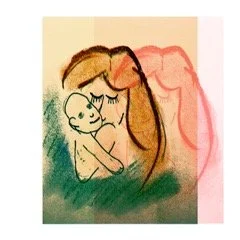
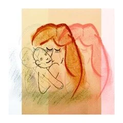
Project 1 was commissioned by Split/Shift Press at Darwin to create a visual essay for a small risographic publication titled “Close to Home 2022”.
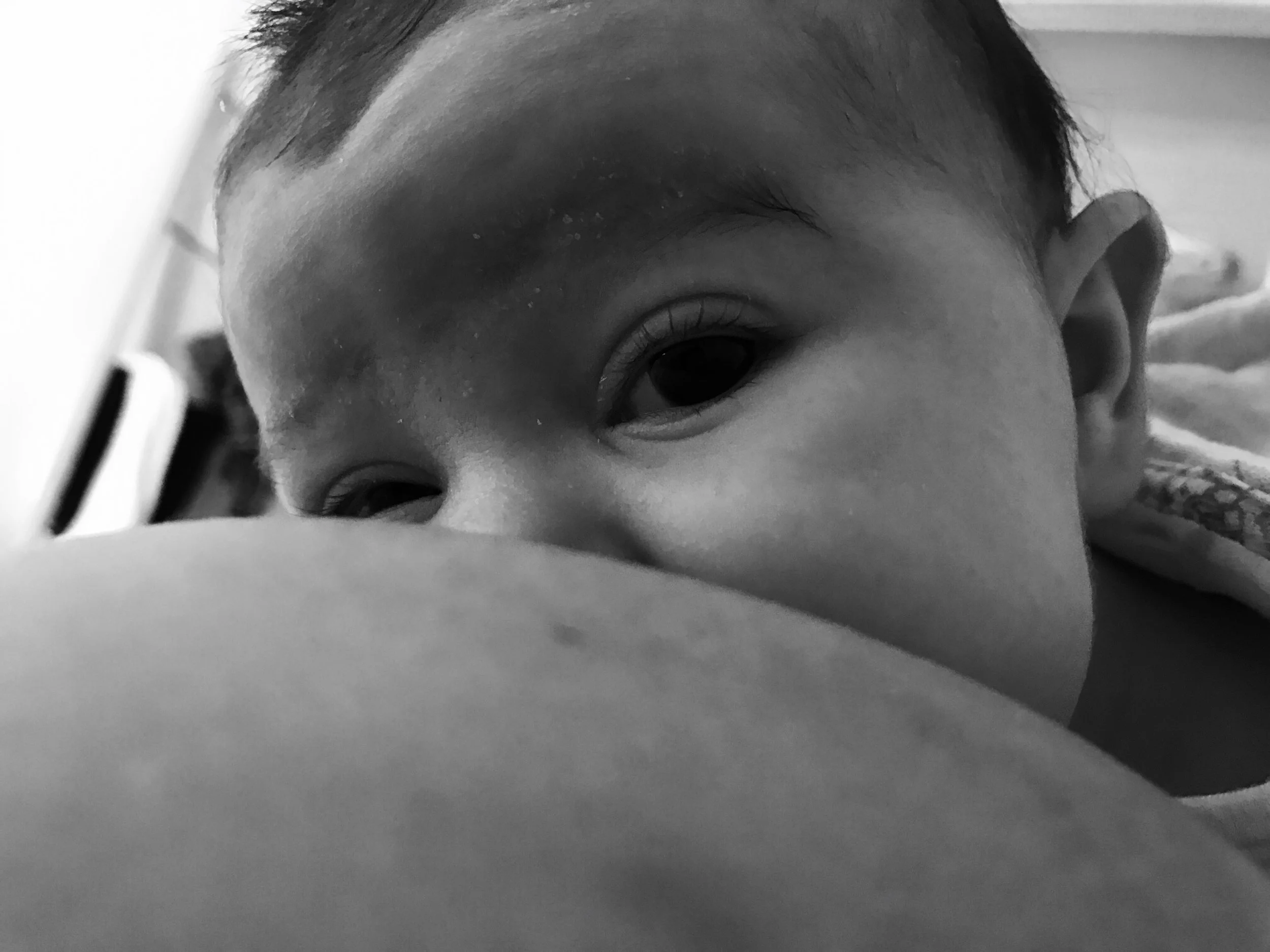
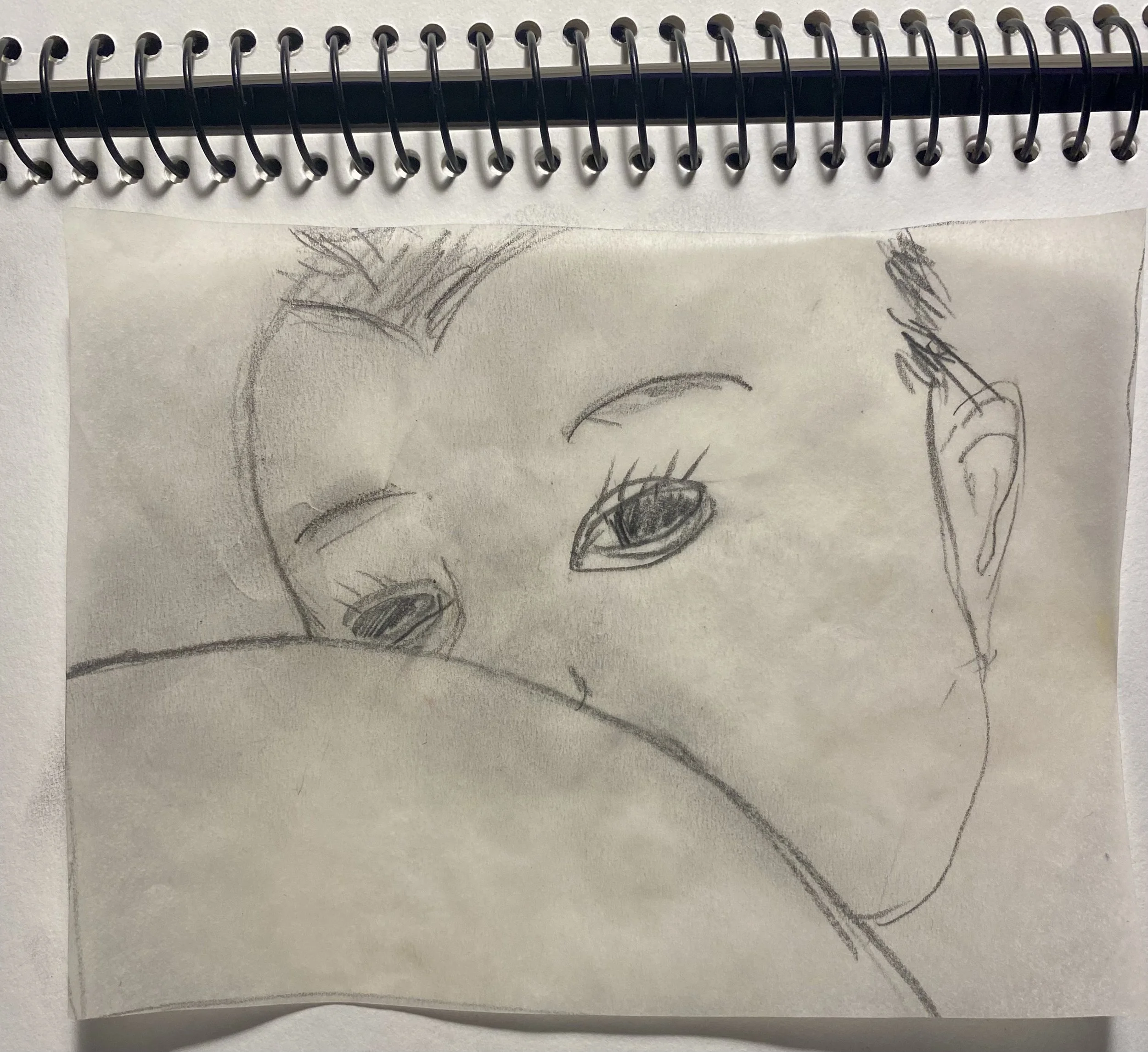
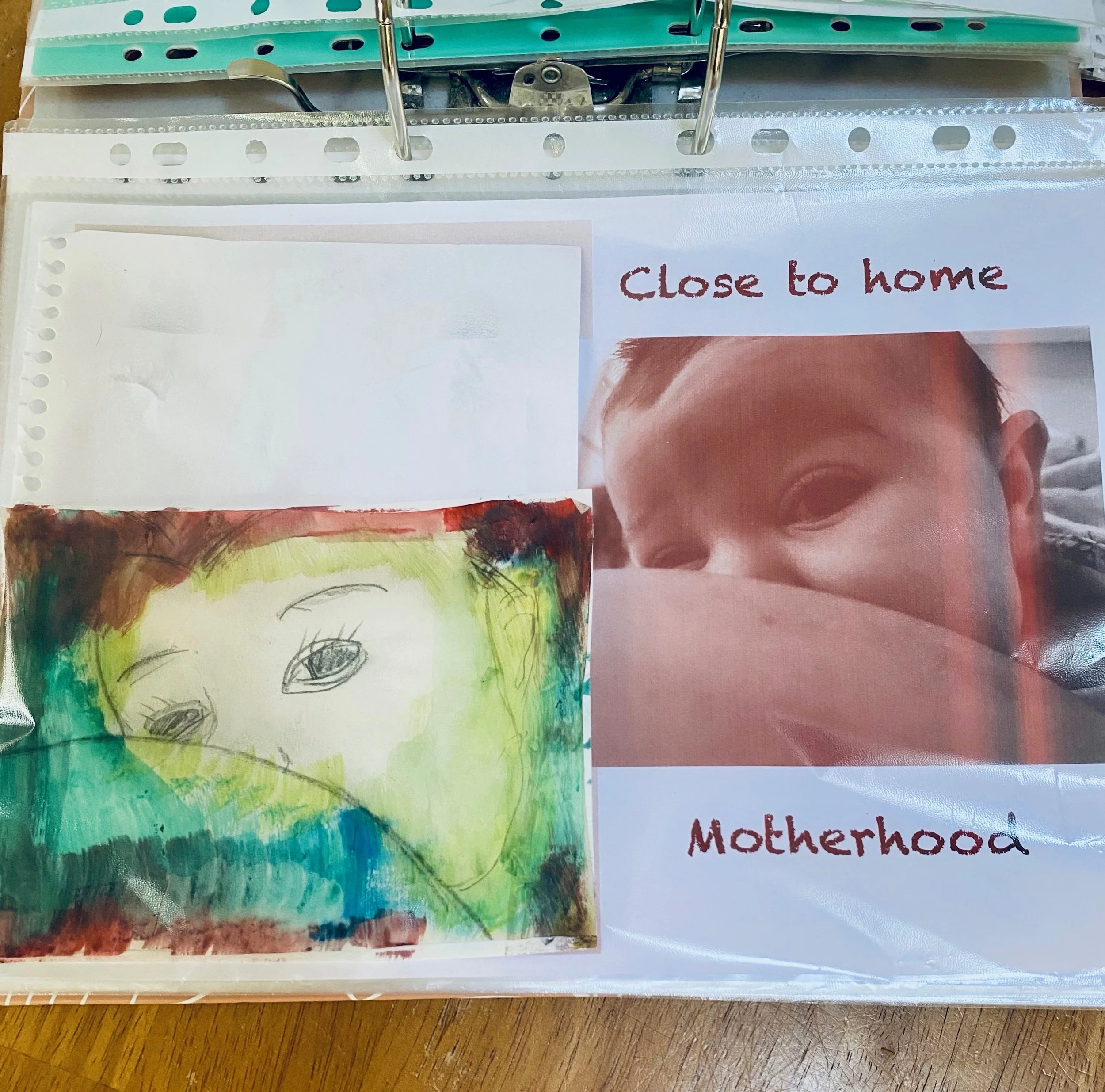
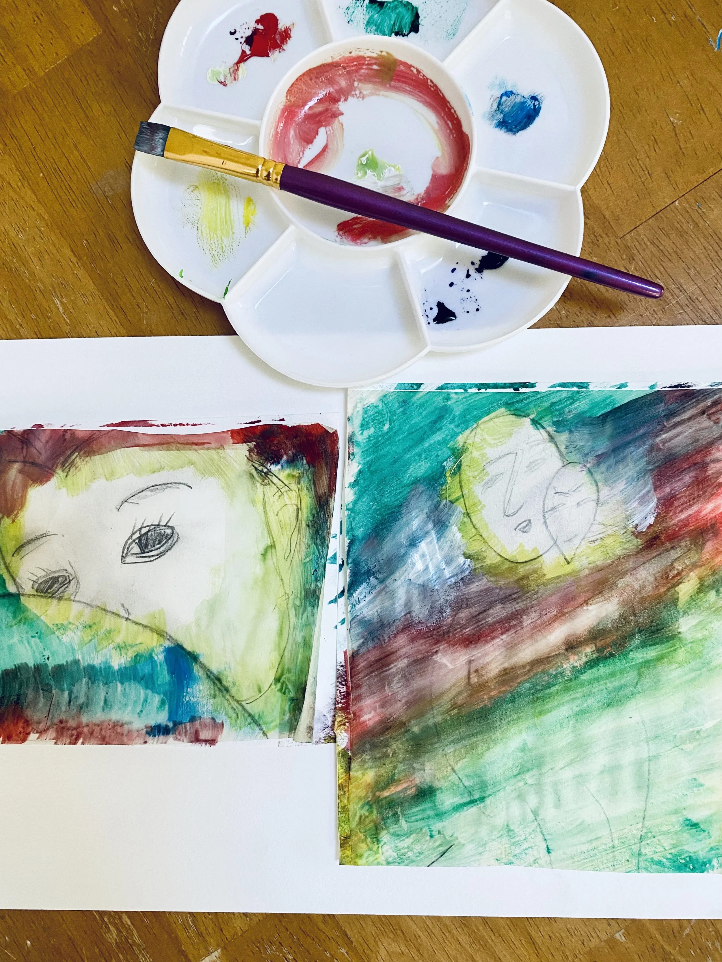
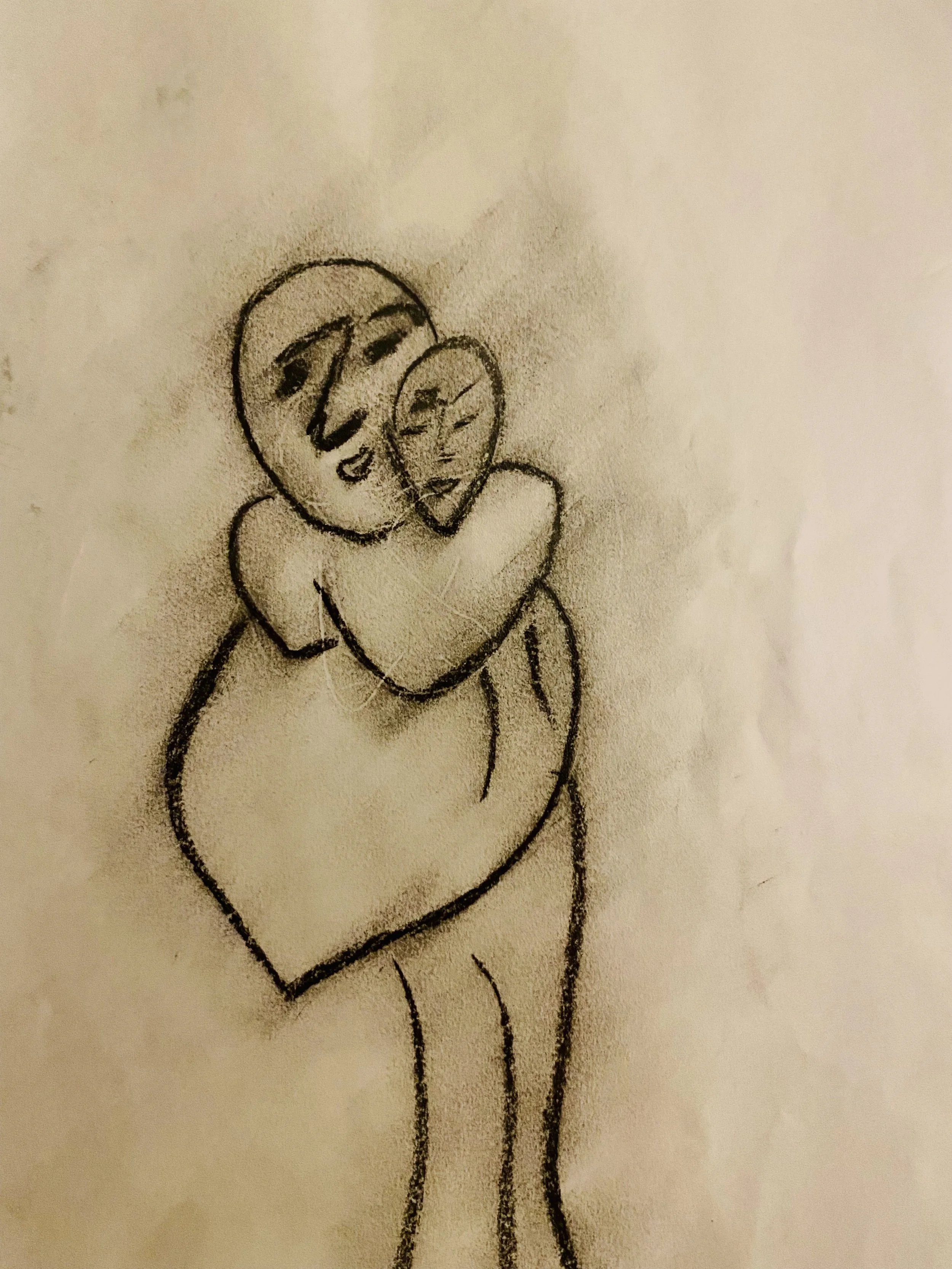
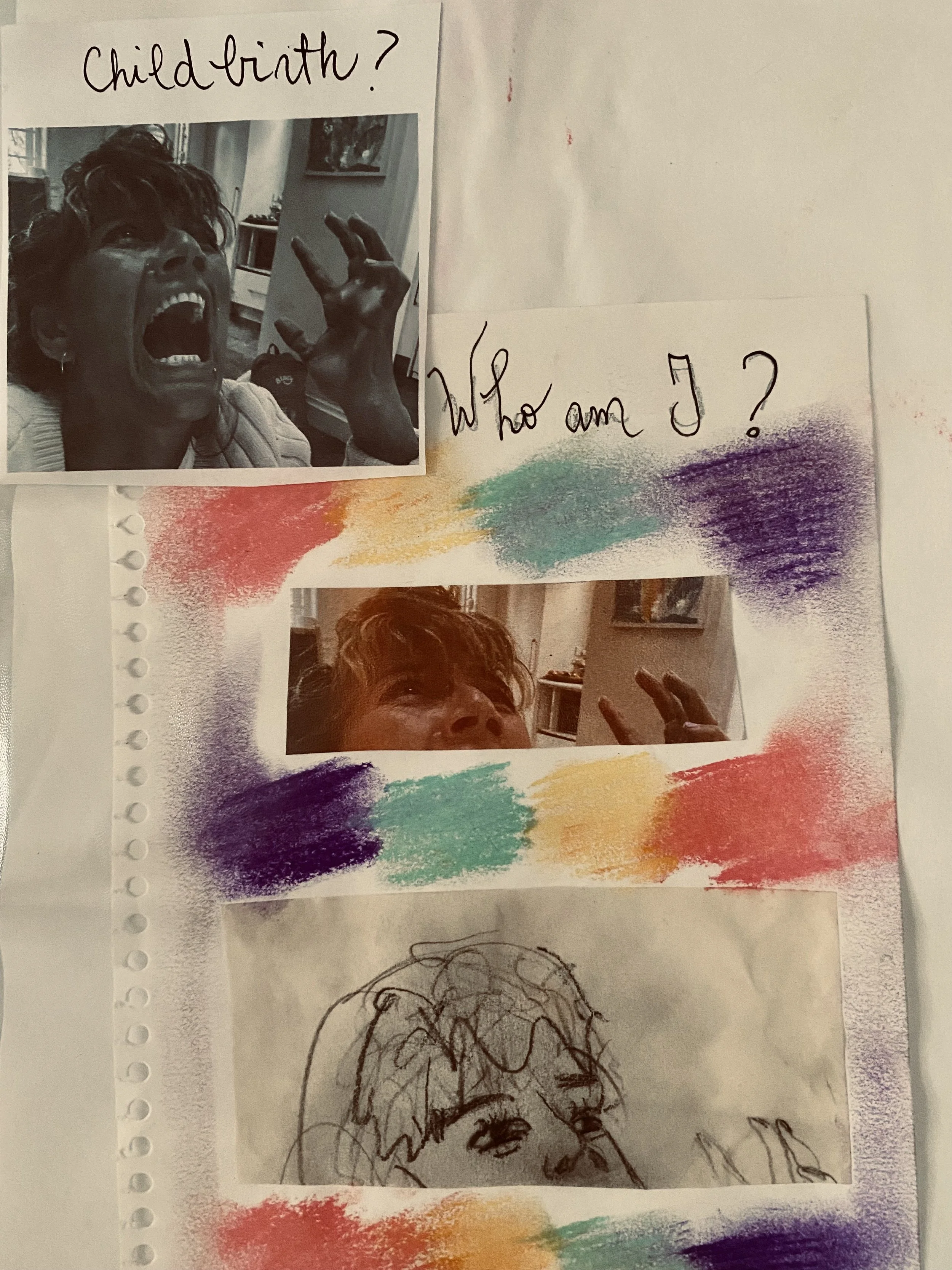
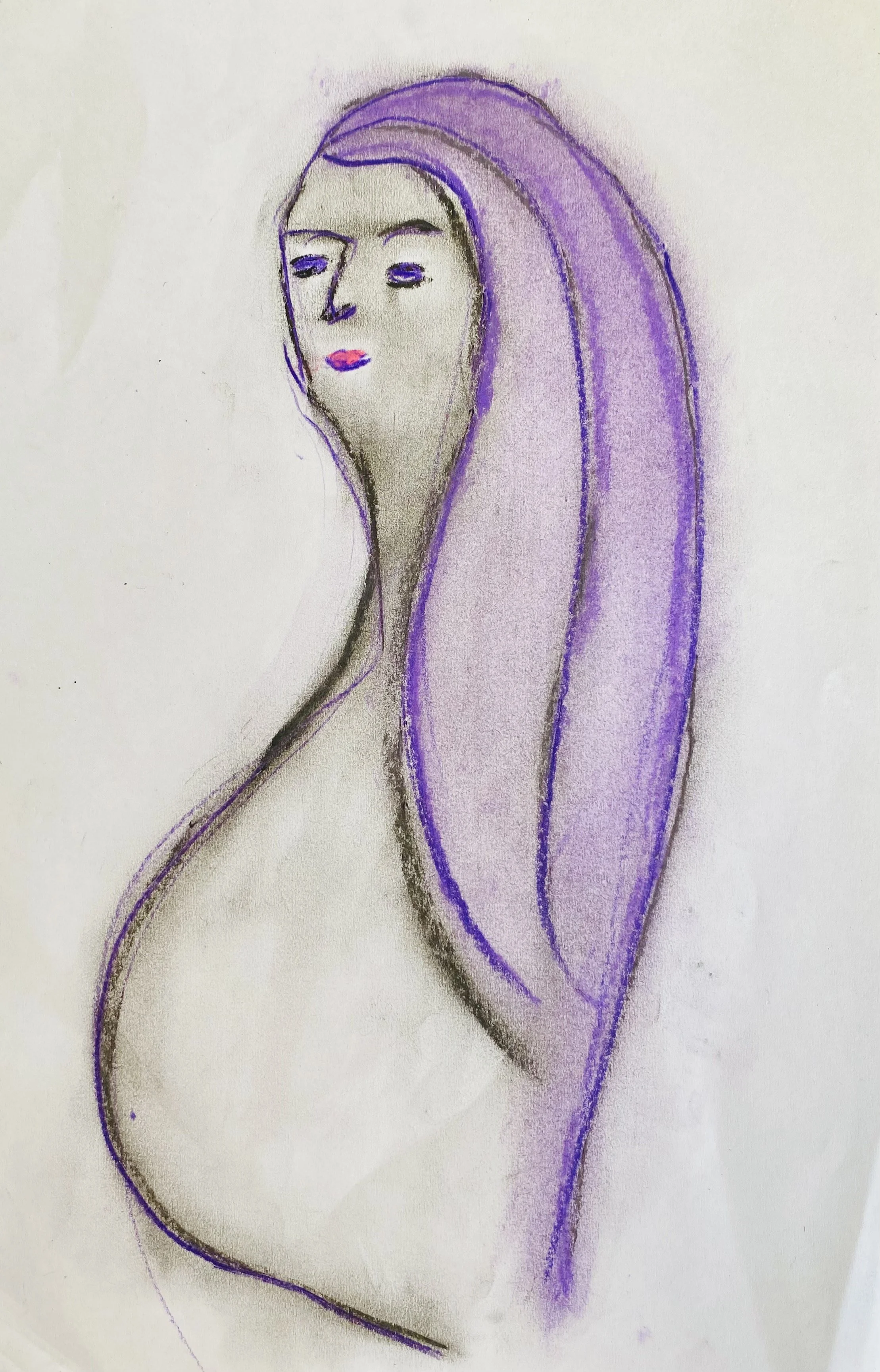
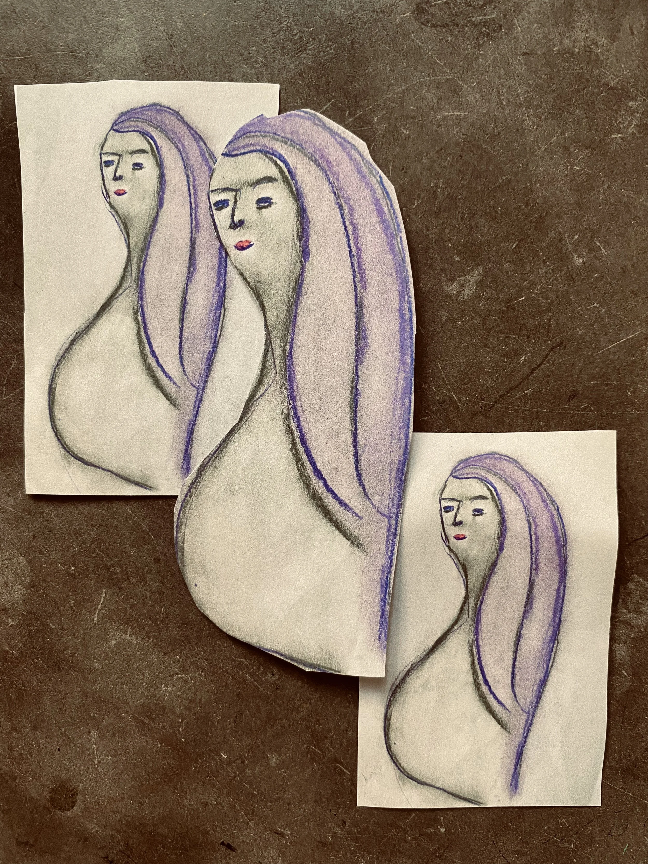
Pregnancy, childbirth and motherhood are meaningful themes to me as I explore my journey as an artist. Close to Home project intention is to share visuals related to these themes and hopefully create connection with other women’s experiences.
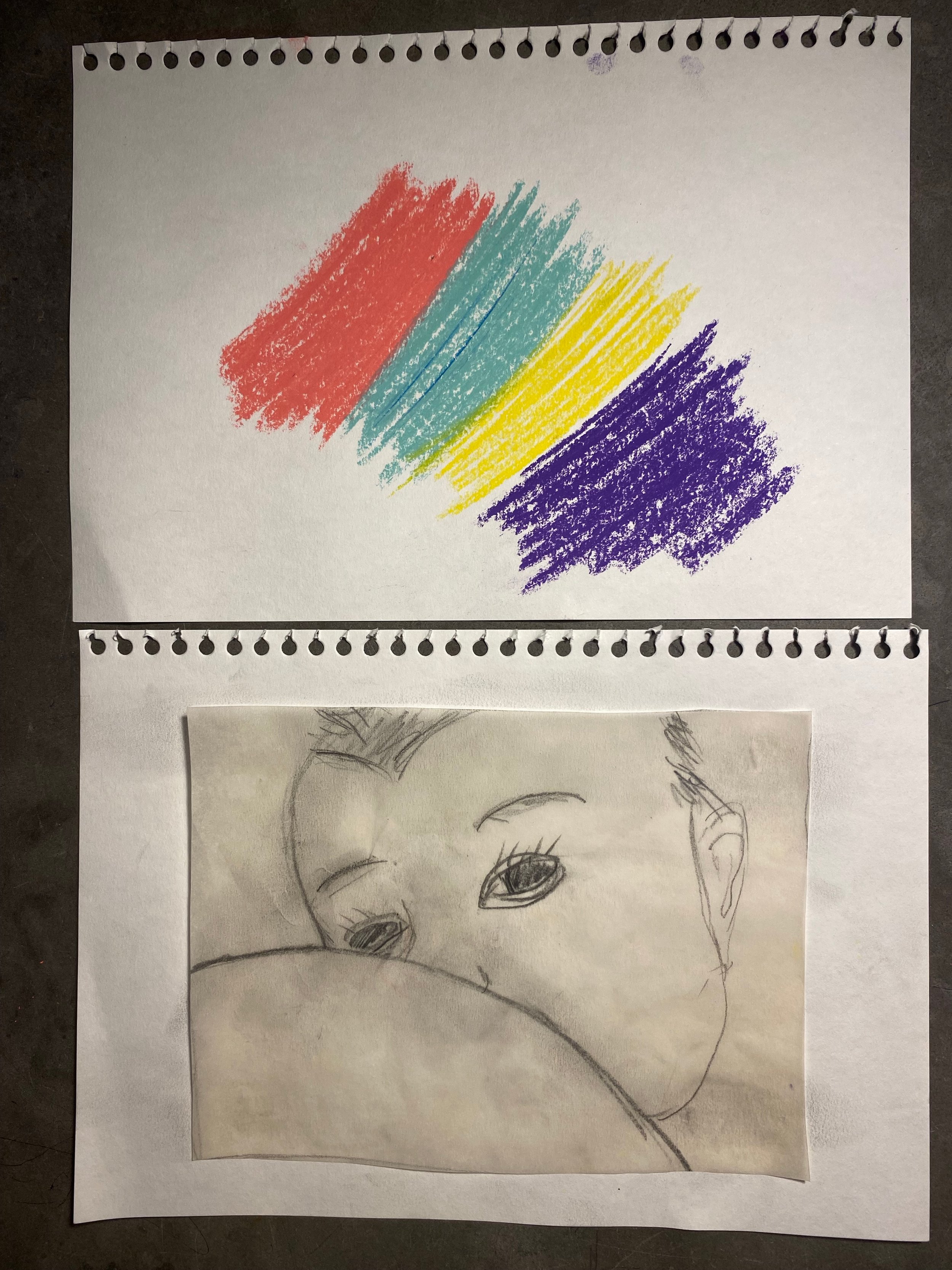
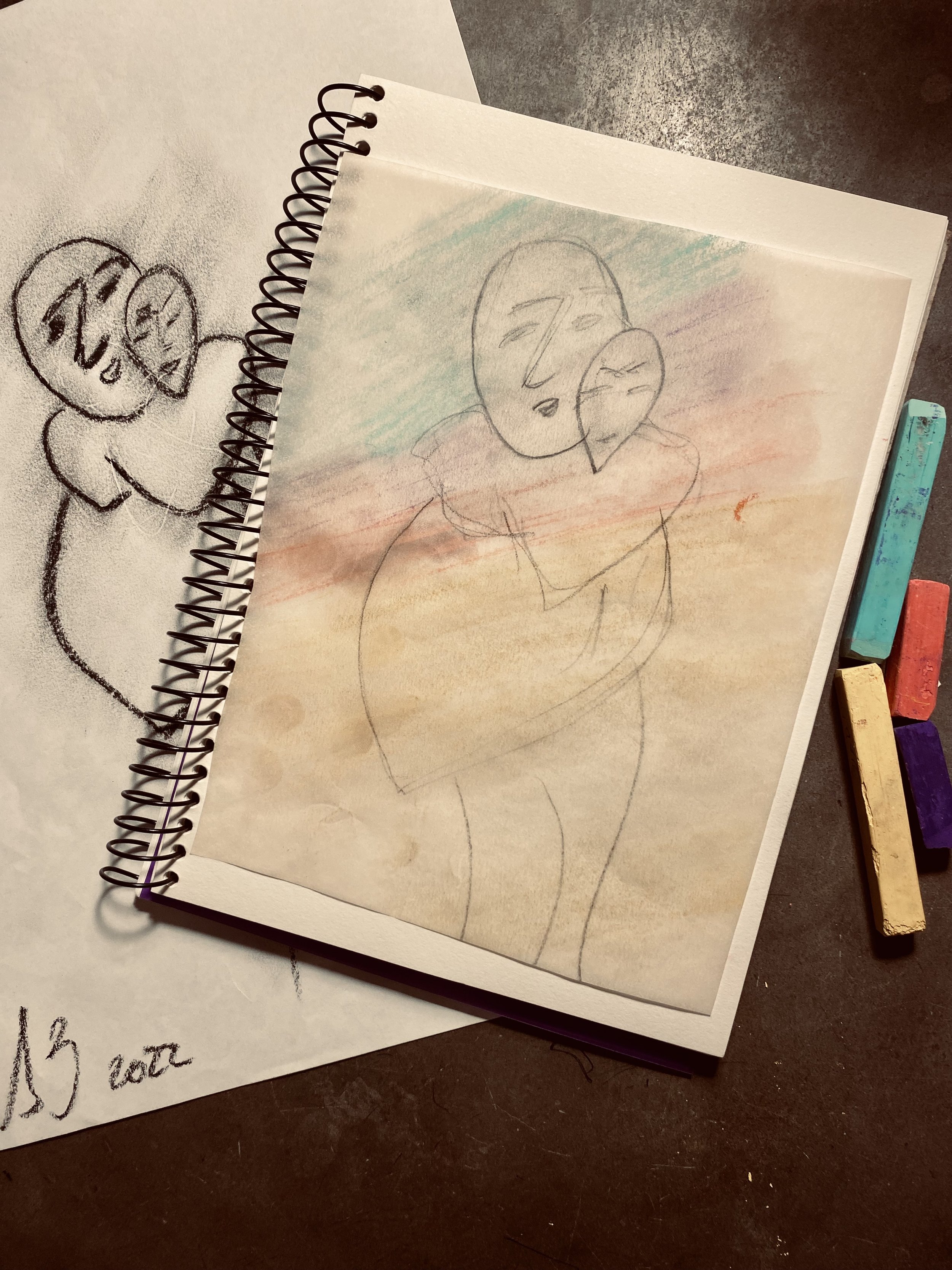
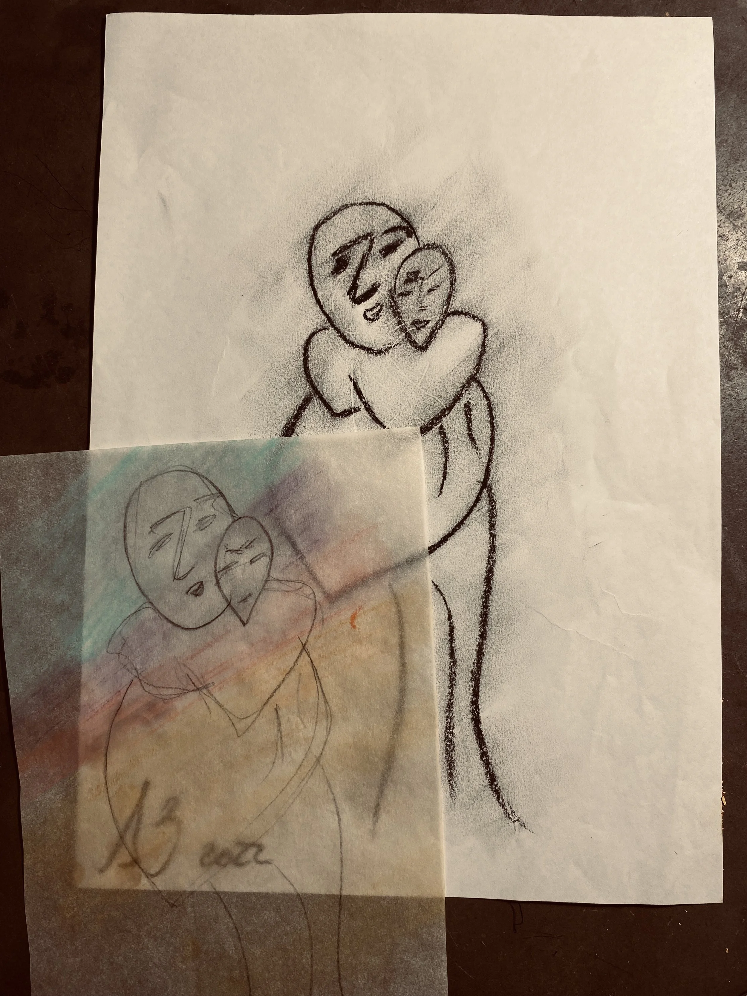
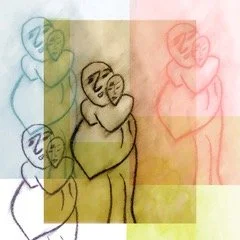
Risograph printing (RISO) is a technique known as 'digital screen printing'. It's known for its vivid colours and its textures. Riso’s inks are vegetable oil-based making it an environmentally friendly printing process.
The layers and overlapped colours used in RISO are chosen purposely to bring a sense of texture and to enhance the idea of separation, change and transformation. The colours: tile, light lime, fluorescent orange and purple are used in soft ways to create confusion and temporary spaces. These are also articulated to the emotions in each visual..
I am hoping this project inspires, supports and honours all the women, mothers, grandmothers and great grandmothers in this planet.
